
This is my solution to the Codecademy Pro project “Roller Coaster” which includes answers to the integral “further credit” questions. The aim is to analyse data on award winning roller coasters and produce graphics to represent the analysis using matplotlib.
Set up code and create some utility functions:
import codecademylib3_seaborn
import pandas as pd
import matplotlib.pyplot as plt

# load rankings data here:
wood_coaster = pd.read_csv('Golden_Ticket_Award_Winners_Wood.csv')
steel_coaster = pd.read_csv('Golden_Ticket_Award_Winners_Steel.csv')

#Examine datasets
print(wood_coaster.head(5))
print(steel_coaster.head(5))
#Enumerated columns: Rank, Name, Park, Location, Supplier, Year Built, Points, Year of Rank

#Determine number of entries in each dataset:
print(len(wood_coaster))
print(len(steel_coaster))
#Each dataset contains 180 entries

#Determine unique suppliers - start by performing UNION on both datasets creating a new index
coaster = pd.concat([wood_coaster, steel_coaster]).reset_index()
coaster.rename(columns={'index': 'type_index'}, inplace= True)

#Display number of unique entries in the Supplier column (=46)
print(len(coaster.Supplier.unique()))

#Do some years include more rankings than others? (10 each from 2013-2015, 50 each from 2016-2018)
by_year = coaster.groupby('Year of Rank').Rank.count().reset_index()
print(by_year)

#Adding some utility functions to search for specific parameters
def find_city(frame, city_state):
  search = lambda x: city_state in x
  return frame.loc[frame['Location'].apply(search)]
def find_park(frame, park):
  search = lambda x: park in x
  return frame.loc[frame['Park'].apply(search)]
def find_ride(frame, ride):
  search = lambda x: ride in x
  return frame.loc[frame['Name'].apply(search)]
#Test functions
print(find_city(coaster, 'Ohio'))
print(find_park(coaster, 'Kings Island'))
print(find_ride(coaster, 'Boulder'))
Plot a line graph of rankings over time for a particular roller coaster:
# write function to plot rankings over time for 1 roller coaster here:
#Added second argument 'park' for case where two parks have coaster with same name
def ranking_plot(ride, park):
  ride_name = find_ride(coaster, ride)
  ride_data = find_park(ride_name, park)
  plt.plot(ride_data['Year of Rank'], ride_data['Rank'], marker='o')
  plt.title('Ride Ranking Over Time for ' + ride)
  plt.xlabel('Year')
  plt.ylabel('Ranking')
  ax = plt.subplot()
  ax.invert_yaxis()
  plt.show()

#Test ranking_plot
ranking_plot('El Toro', 'Six Flags')

plt.clf()
Plot two lines on the same graph to compare rankings over time for two roller coasters:
# write function to plot rankings over time for 2 roller coasters here:

def comparative_ranking(ride1, park1, ride2, park2):
  ride1_name = find_ride(coaster, ride1)
  ride1_data = find_park(ride1_name, park1)
  ride2_name = find_ride(coaster, ride2)
  ride2_data = find_park(ride2_name, park2)
  plt.plot(ride1_data['Year of Rank'], ride1_data['Rank'], marker='o')
  plt.plot(ride2_data['Year of Rank'], ride2_data['Rank'], marker='o')
  plt.title('Ride Ranking Over Time')
  plt.xlabel('Year')
  plt.ylabel('Ranking')
  ax = plt.subplot()
  ax.invert_yaxis()
  plt.legend([ride1 + '@' + park1, ride2 + '@' + park2])
  plt.show()

#Test comparative_ranking
comparative_ranking('El Toro', 'Six Flags', 'Boulder Dash', 'Compounce')

plt.clf()
Plotting top five ranking roller coasters against time; the test example displays the top 5 wooden roller coasters:
# write function to plot top n rankings over time here:

def top_ranked (n, frame):
  top_rides = frame[frame['Rank'] <= n]
  legend = []
  plt.figure(figsize=(10,10))
  plt.title('Top 5 Ride Rankings Over Time', y = 0)
  plt.xlabel('Year')
  plt.ylabel('Ranking')
  for name in set(top_rides['Name']):
    rankings = top_rides[top_rides['Name'] == name]
    ax = plt.subplot()
    ax.plot(rankings['Year of Rank'], rankings['Rank'], marker = 'o')
    ax.set_yticks(range(1, 2*n-2))
    ax.set_yticklabels(range(1, n+1))
    ax.invert_yaxis()
    ax.xaxis.tick_top()
    ax.xaxis.set_label_position('top')
    legend.append(name)
  plt.legend(legend, loc=4)
  plt.show()

#Test function
top_ranked(5, wood_coaster)

plt.clf()
Load in a further data set:
# load roller coaster data here:

captain_coaster = pd.read_csv('roller_coasters.csv')
#Inspect data
print(captain_coaster.head())
#Enumerated Columns: name, material_type, seating_type, speed, height, length, num_inversions, manufacturer, park, status
Plot a histogram of any numeric column of the Captain Coasters dataset:
# write function to plot histogram of column values here:
def histogram(frame, column):
  plt.figure(figsize=[10,10])
  clean_frame = frame.dropna()
  plt.hist(clean_frame[column], bins=30, normed = True)
  plt.title('Histogram of Ride ' + column + ' Distribution')
  plt.ylabel('Frequency')
  plt.xlabel(column)
  plt.show()
#Test function histogram()
histogram(captain_coaster, 'speed')
plt.clf()
Plot the number of inversions performed by each ride at a specific park:
# write function to plot inversions by coaster at a park here:
def inversions(frame, park):
  park_data = frame[frame['park'] == park]
  park_data = park_data.dropna()
  park_data = park_data.sort_values('num_inversions', ascending=False)
  plt.figure(figsize=[10,10])
  ax = plt.subplot()
  plt.bar(range(len(park_data['name'])), park_data['num_inversions'])
  plt.title('Number of Inversions by ride at ' + str(park_data['park'].unique()).strip('[]\''))
  plt.ylabel('No. Of Inversions')
  ax.set_xticks(range(len(park_data['name'])))
  ax.set_xticklabels(park_data['name'].tolist(), rotation='vertical')
  plt.show()
#Test function inversions()
inversions(captain_coaster, 'Six Flags Great Adventure')

plt.clf()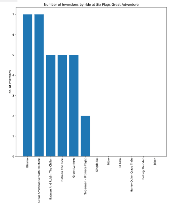
Plot pie chart to display proportion of open rides:
# write function to plot pie chart of operating status here:
def pie_chart(frame):
  operating = frame[frame['status'] == 'status.operating']
  closed = frame[frame['status'] == 'status.closed.definitely']
  pie_plot = [len(operating), len(closed)]
  plt.pie(pie_plot, autopct='%0.1f%%', labels= ['Operating', 'Closed'])
  plt.axis('equal')
  plt.title('Proportion of Operating vs Closed Roller Coasters')
  plt.show()

#Test function pie_chart()
pie_chart(captain_coaster)

plt.clf()
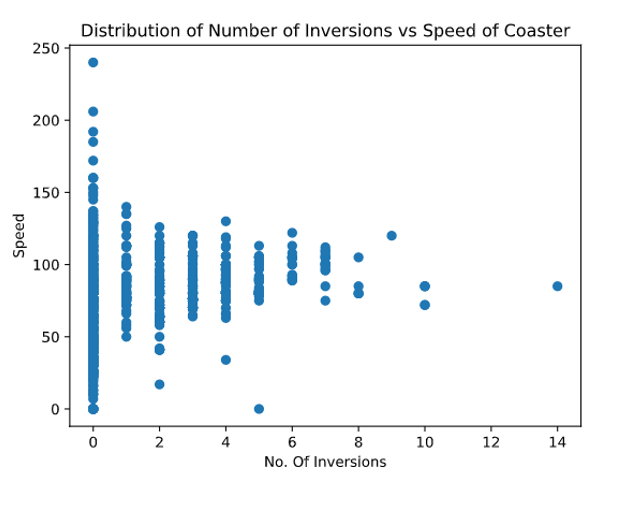
Display a scatter plot of any two numeric columns from the data set:
# write function to create scatter plot of any two numeric columns here:

def scatter_plot(frame, col1, col2):
  clean_frame = frame.dropna()
  plt.scatter(clean_frame[col1], clean_frame[col2])
  plt.title('Distribution of Number of Inversions vs Speed of Coaster')
  plt.xlabel('No. Of Inversions')
  plt.ylabel('Speed')
  plt.show()
#Test function scatter_plot()
scatter_plot(captain_coaster, 'num_inversions', 'speed')

plt.clf()
Display proportions of seating types for roller coasters:
#Most popular seating type
def display_seating(frame):
  clean_frame = frame.dropna()
  seat_type = clean_frame['seating_type'].unique()
  pie_plot = []
  for i in seat_type:
    value = clean_frame[clean_frame['seating_type'] == i]
    pie_plot.append(len(value))
  plt.figure(figsize=[10,10])
  plt.pie(pie_plot, autopct='%0.1f%%')
  plt.axis('equal')
  plt.title('Distribution of Seat Types')
  plt.legend(seat_type)
  plt.show()
#Test function display_seating:
display_seating(captain_coaster)
Does seating type affect other attributes of the roller coaster, for example speed?
#Effect of seating on mean value of another parameter
def seat_means(frame, parameter):
  clean_frame = frame.dropna()
  seat_type = clean_frame['seating_type'].unique()
  bar_plot = []
  for i in seat_type:
    by_seat = clean_frame[clean_frame['seating_type'] == i]
    value = by_seat[parameter].median()
    bar_plot.append(value)
  plt.figure(figsize=[10,10])
  ax = plt.subplot()
  plt.bar(range(len(seat_type)), bar_plot)
  ax.set_xticks(range(len(seat_type)))
  ax.set_xticklabels(seat_type, rotation='vertical')
  plt.ylabel('Median '+ parameter)
  plt.title('Median speed of coasters against seating type')
  plt.show()
#Test function seat_means()
seat_means(captain_coaster, 'speed')

plt.clf()
Do manufacturers focus on specific roller coaster properties?
#Display manufacturer data compared to whole for numeric parameter
def manufacturer (frame, manufacturer, parameter):
  clean_frame = frame.dropna()
  search = lambda x: manufacturer in x
  manu_data = clean_frame.loc[clean_frame['manufacturer'].apply(search)].reset_index()
  plt.figure(figsize=[10,10])
  plt.hist(manu_data[parameter], bins=20, normed = True, label = manufacturer + ' Rides')
  plt.hist(clean_frame[parameter], bins=20, histtype='step', linewidth =2, normed = True, label = 'All Rides')
  plt.title('Histogram of Ride ' + parameter + ' Distribution for '+ manufacturer + ' Rides')
  plt.ylabel('Frequency')
  plt.xlabel(parameter)
  plt.legend()
  plt.show()
#test function manufacturer()
manufacturer(captain_coaster, 'Vekoma', 'num_inversions')

I just finished a couple series on Pandas and MatPlotLib. This a well formed article and you provide a rather unique perspective that’s very helpful for comprehension. I look forward to seeing what you put out in the future.
LikeLiked by 1 person
Thank you, your comments are greatly appreciated! I’m very much cutting my teeth on coding, but I am making good progress through several interactive learning platforms. Hopefully more to follow in due course!
LikeLiked by 1 person